Thursday, November 4, 2010

Under the Nickel Bridge

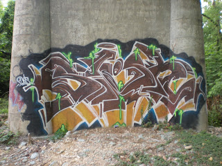
One of the lesser traveled riverside trails runs from the Pumphouse in Byrd Park downstream to "Texas Beach," the old mill site and eventually the Northbank stairs. It was on this trail that I encountered my first graffiti mural 'gallery' on the concrete supports of the Nickel Bridge a.k.a. Boulevard Bridge. The quality of the murals seemed to deteriorate the further they were from the trail but the closest ones are vivid and oozing with color and life.


 The first two are my favorites. Both seem alive but in different ways. The first mural of oranges and blues seems almost to move or scrunch itself up while the brown,  yellow and green mural appears to be oozing some kind of organic (?) substance or is starting to sprout something very green....


 I find it intriguing that, in a medium known for its unclear/ambiguous letters and words, this mural has the word "radio" clearly spelled out at the end. Fascinating to me because I am studying radio but also because radio is such a technological leap from wall painting but both are linked as forms of communication.

Is it? or Isn't it? 

Sunday, August 15, 2010

Belle Isle hydro plant

It was a spectacular mural at the abandoned Vepco hydroelectric plant on Belle Isle, long painted over, that got me to thinking about the ephemeral nature of graffiti and the value of capturing some of it. For example, the masthead image on this blog was taken inside the larger building, looking through one of the 4" thick steel generator housings and the image is fertile with interpretive possibility. 

But sometimes interesting or insightful graffiti takes simpler forms like handwriting in felt tip marker or paint stenciled images. The bear stenciled in orange below evokes the Grateful Dead style bear and the overspray on the top of the image seems to suggest a fire in the distance or perhaps the sun rising or setting on a horizon - the ambiguity is powerful whether deliberate or not.


I had originally misread the stencil below to read "BOULET!" which turned up nothing in Google, but when my wife saw the image she immediately recognized Robert Goulet whose varied multimedia career was unknown to me. Outside of his many entertainment accomplishments, I couldn't figure out why he would be the subject of a stencil until I heard of the "Robert Goulet Memorial Mustached American of the Year" award.
I could be wrong, but my guess is the stenciler thought that anyone with a mustache impressive enough to inspire an award was worthy of becoming a graffiti stencil.


Stenciling technology is an inexpensive and portable method of increasing the uniformity and production speed of images but felt-tip markers are even cheaper and faster for producing text. We might be more likely to dismiss marker graffiti since much of the illicit handwritten messages we see on various public surfaces are predictably low in depth of content but high in graphic sexual invitation - which are at least better than hateful, bigoted graffiti - or at least I think so. 


But if we were to dismiss handwritten marker graffiti because of such sensual suggestion we might miss some intriguing statements & questions or perhaps some unexpected wisdom and truth.


Thursday, August 12, 2010

grammatical graffiti?


We don't usually associate grammar and graffiti but we might. The Oxford English Dictionary (OED) tells us that the word grammar is linked to the word glamor and thus magic. But the spell that graffiti puts on us is more aesthetic than semantic, so grammatical conventions can be ignored to free up other communicational potentials. When grammar rules are discarded in graffiti the purpose is to shake us out of conditioned consciousness and expand the meaning and aesthetic pleasure of letters. By contrast, text messagers ignore standard grammar to increase the speed of their communication.

My interest in graffiti bloomed after speaking with a young artist named Dylan Mott who had "tagged" a print of Monet's "Regatta at St. Andresse" in an aesthetically sophisticated way that caught my attention and got me asking questions. What was that word? Right? Rick? Rigls?

When I said I couldn't read the word and asked Mott what it was, he said it wasn't a word - it was more of a design. As a teacher I was astonished to consider, sadly for the first time, that letters could be used for something other than semantic content. Upon closer inspection, I discovered that even the identity of the individual letters was uncertain. Each shape suggested, but did not settle upon, multiple possibilities, a K or an X or an R.


So it seems that, though our pipe-smoking tagger above might choose to follow grammatical conventions in his graffiti, they are not required. Many tags depart from traditional forms and uses to suggest new ways of seeing and communicating - and this is an necessary, and often enjoyable, challenge for the human mind.

Tuesday, August 10, 2010

sage o' skulls

I'm not sure if the image above could be considered 'mixed media' but I was drawn to it by the unique stenciling combined with contrasting decorative text. This image is/was on the transformer building at the abandoned Virginia Electric Power hydroelectric plant on Belle Isle, active from 1904-1963.

Usually paint fills in the empty space of a stencil but here the empty space provides the image somewhat like a silhouette. The black & red contrast is striking and the cattle skulls are not a common stencil motif.

The word "sage" offers perhaps the most semiotic possibility as it can be defined as a wise person, an evergreen shrub or a culinary spice. Our interpretive challenge now is to read the significance of the skull silhouettes.

Here the painter uses the traditional fill-in stencil approach and instead of a word, surrounds the skull with what looks like a red crescent - or maybe a semi-circle of blood...

Thursday, August 5, 2010

The 'conversation' strays

Now painted over, these magic-marker graffiti sadly stray into hateful expressions mixing racism, homophobia, nazism & satanism:


...and the ancient but familiar phallic symbol

Here, an intriguing slogan and a familiar name.


Let's take a closer look at the slogan.
It could be an accidental misspelling but more likely it's a clever sentiment that could only be perceived in print. In speech, "right" and "write" are homonyms and would not suggest what text can. The smiley face in the exclamation points keeps it from seeming angry and suggests playfulness, perhaps even intoxication as commonly signified by "x" eyes.

Though also written in magic marker, I doubt this was written by the same person who made the ugly racist logo - too playful & too intelligent.